

TL;DR:
- Color influences mood, perception, and space in home design, making strategic choices essential.
- Lighting significantly impacts how colors appear, requiring testing in actual room conditions.
- Using accent pieces and thoughtful color schemes can refresh spaces with minimal effort.
Color is far more than a finishing touch. The colors you choose for your living spaces actively shape how you feel, how energized or relaxed you are, and even how large or small a room seems. Most people treat paint selection as a purely decorative decision, but research consistently shows that color influences mood, focus, and comfort in measurable ways. This guide walks you through the psychology behind color, how lighting shifts the way colors look, and room-by-room tips that make it easy to apply what you learn. Whether you’re planning a full refresh or just adding a few accents, you’ll find practical, actionable ideas here.
Table of Contents
- Why color matters in home spaces
- The psychology of color: How hues shape your mood
- Lighting and color: Creating the perfect ambiance
- Color tips for every room: Practical inspiration
- Our take: Most homes miss out on color’s true potential
- Transform your home with color-forward design
- Frequently asked questions
Key Takeaways
| Point | Details |
|---|---|
| Color impacts mood | The colors you choose can make your home feel calm, energetic, or cozy. |
| Lighting changes everything | Natural and artificial lighting will affect how every color looks on your walls and decor. |
| Accent updates are easy | Introduce color through accent pieces for instant, low-risk transformation. |
| Personal style matters | The best color choices reflect your unique taste and comfort, not just trends. |
Why color matters in home spaces
Color is one of the most powerful tools in your home, yet most people choose it without a real strategy. You might pick a shade because it looks nice on a paint chip, only to find it feels completely different once it’s on the walls. Understanding why that happens starts with knowing a few basic terms.
Hue is simply the color itself, like red, blue, or green. Saturation refers to how vivid or muted that color is. Value describes how light or dark the color appears. Together, these three properties determine how a color behaves in your space.
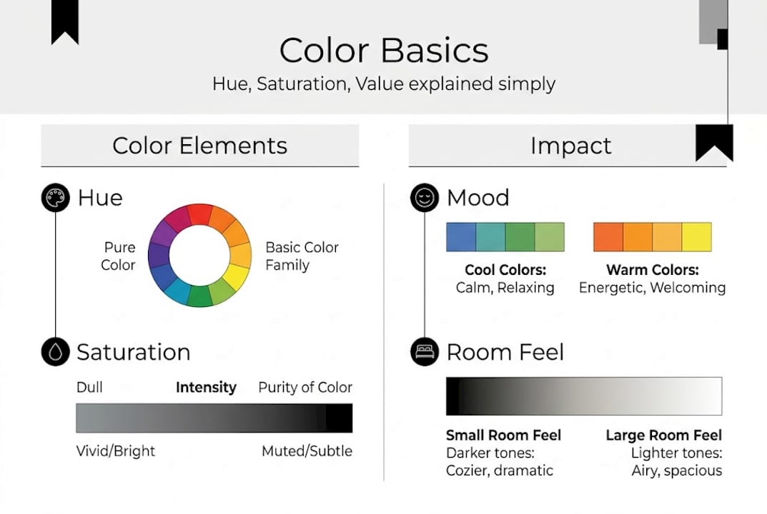
Here’s why this matters: color influences mood, productivity, and comfort within the home. Warm tones like orange, red, and yellow tend to feel stimulating and social. Cool tones like blue, green, and violet tend to feel calm and restful. Neutral tones like beige, gray, and white can go either way depending on how they’re paired.
Color also plays tricks with space. Lighter colors reflect more light, which makes a room feel larger and more open. Darker colors absorb light, which makes a space feel more intimate and cozy. This is not just a design myth. It’s a reliable effect you can use deliberately.
“We spend roughly 87% of our time indoors, which means the colors surrounding us every day have a significant and ongoing effect on our wellbeing.”
Beyond mood and space, color affects how welcoming your home feels to guests and how comfortable it feels to you. A space with no intentional color strategy often ends up feeling flat or disconnected, even if the furniture is high quality. Exploring interior decor styles can help you find a color direction that matches both your personality and the function of each room.
Key effects of color in your home:
- Warm tones create energy and encourage conversation
- Cool tones promote calm and focus
- Neutral tones provide balance but need accents to avoid blandness
- Dark colors add drama and coziness to large rooms
- Light colors open up tight or low-lit spaces
The goal is not to follow rigid rules but to make intentional choices that serve how you actually use each room.
The psychology of color: How hues shape your mood
Every color carries emotional associations that are surprisingly consistent across people. These are not random. They’re built on years of human experience and cultural context. Certain colors promote relaxation while others boost energy, and knowing which does which gives you real control over how your home feels.
Here’s a quick reference for the most common home colors and their psychological effects:
| Color | Mood effect | Best room use |
|---|---|---|
| Blue | Calm, focused, trustworthy | Bedroom, home office |
| Green | Balanced, refreshing, natural | Living room, bathroom |
| Yellow | Optimistic, energizing, cheerful | Kitchen, entryway |
| Red | Energetic, bold, appetite-stimulating | Dining room, accent walls |
| Gray | Neutral, sophisticated, cool | Any room as a base |
| White | Clean, open, airy | Small spaces, bathrooms |
| Terracotta | Warm, grounded, inviting | Living room, bedroom |
This table gives you a starting point, but context matters a lot. A soft sage green in a bedroom feels very different from a bright lime green. Saturation and value always influence the final emotional effect.
Where to put specific colors in your home:
- Bedroom: Soft blues, muted greens, and warm lavenders encourage rest
- Kitchen: Yellows and warm whites stimulate appetite and morning energy
- Living room: Earthy tones and muted teals create social warmth
- Home office: Medium blues and greens support focus and reduce eye strain
- Bathroom: Cool whites, soft blues, and pale greens feel clean and refreshing
Looking at decor styles and mood alongside color psychology helps you match the right palette to your existing aesthetic, whether that’s minimalist, bohemian, or mid-century modern.
Pro Tip: You don’t need to paint every wall. Use a bold color on one accent wall, then echo it in smaller doses through throw pillows, a rug, or artwork. This layering approach creates cohesion without overwhelming the room.
Lighting and color: Creating the perfect ambiance
Here’s something most people don’t realize until after they’ve already painted a room: the same color can look completely different depending on the light hitting it. Lighting can dramatically change how colors appear, sometimes making a warm beige look pink in the morning and yellow in the afternoon.
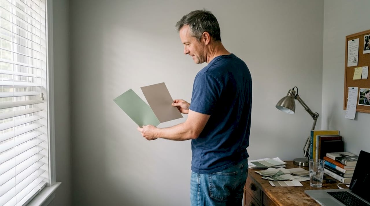
Understanding lighting and color interaction is just as important as selecting the color itself. Natural sunlight shows colors at their truest. North-facing rooms receive cooler, bluish light that can make warm tones feel flat. South-facing rooms get warmer, brighter light that makes most colors look richer.
Artificial lighting adds another layer of complexity:
| Lighting type | Effect on warm colors | Effect on cool colors |
|---|---|---|
| Warm white bulbs (2700K) | Enhances, looks cozy | Mutes, can look dull |
| Neutral white bulbs (3500K) | Balanced | Balanced |
| Cool white bulbs (5000K) | Can look washed out | Crisp, vibrant |
| Natural daylight | Truest appearance | Truest appearance |
A common mistake is testing paint samples only during the day or under one type of light. A color that looks perfect in bright afternoon sun might feel entirely different in the evening under your living room lamps. This is especially important in rooms you use most in the evening, like bedrooms and living rooms.
Understanding lighting’s impact on ambiance helps you avoid costly repainting jobs and gives you confidence in your color decisions before you commit.
Pro Tip: Tape large paint swatches (at least 12 by 12 inches) to your walls and observe them at different times of day and under your actual light fixtures. Check them in the morning, midday, and evening before making a final decision. You can also explore how to arrange lighting for style to support your color palette rather than fight against it.
Color tips for every room: Practical inspiration
Accent pieces and color trends can update a home without major renovation, which means you have more options than you might think. You don’t need to repaint every room or buy all new furniture to make a meaningful change.
Here are the best color practices by room:
- Living room: Start with a warm neutral as your base, like a soft greige or warm white. Then introduce color through a sofa, area rug, or a curated gallery wall. This keeps the room flexible as trends shift.
- Kitchen: Warm yellows, sage greens, and terracotta work especially well here. If you have wood cabinets, a deep navy or forest green on a feature wall creates great contrast.
- Bedroom: Prioritize calm over stimulation. Soft blues, dusty pinks, and muted greens help your brain wind down. Avoid highly saturated or warm colors that signal daytime energy.
- Bathroom: Light, cool tones make bathrooms feel fresh. White, pale blue, and soft gray are reliable choices. Warm wood accents can balance the coolness nicely.
Quick wins that add color without a big commitment:
- Swap throw pillow covers for a seasonal color update
- Add a colorful area rug to anchor a neutral room
- Hang a piece of bold wall art as a focal point
- Use colored lamp shades to shift the mood of a corner
- Style open shelves with colored books or ceramic accessories
Bold colors work best when used sparingly. A single deep-toned accent piece draws the eye without overwhelming the room. Neutrals handle the heavy lifting as a backdrop, while accent pieces carry the personality. Browsing modern color ideas can help you find combinations that feel current without being trendy for just one season.
Our take: Most homes miss out on color’s true potential
We’ve worked with hundreds of home setups, and one pattern keeps showing up: people play it too safe. Gray and white walls everywhere. Beige furniture. Neutral everything. The result is a space that photographs well but doesn’t actually feel like home.
Here’s the contrarian truth. The design rules around color are guidelines, not laws. A bedroom absolutely can have a terracotta accent wall if that color makes you feel grounded and warm. A living room can handle a bold jewel-toned sofa if the rest of the space is restrained. The goal is not to follow a formula but to make choices that reflect who you actually are.
We’ve seen a single swap, like switching from a gray area rug to a rust-toned one, completely change the energy of a room. No repainting. No new furniture. Just one considered accent color decision that shifted the whole palette.
The best color strategy is one you’re willing to actually use. Start small, observe how the change makes you feel, and build from there. Color should excite you about coming home.
Transform your home with color-forward design
Inspired to try something new? Putting color advice into action is easier when you have the right pieces to work with.
At New Way Ref, we carry a thoughtfully curated range of furniture and decor built to bring color and style into your home without the hassle. Looking for a statement piece? The blue modular sofa is a bold, functional anchor for any living room, and it ships free on orders over $50. For a warmer, more textured look, the distressed faux suede dining chair adds rich earthy tone and modern structure. Browse our full collection and find the pieces that turn your color vision into a real, livable space.
Frequently asked questions
What is the best color for a small living room?
Lighter shades like soft blues, greens, or warm neutrals make a small living room feel larger and more open. These tones reflect light effectively, which is key to creating the illusion of space in tighter rooms.
How do I choose colors that complement each other?
Use the color wheel: combine analogous colors for harmony or complementary colors for a dynamic effect. Studying color wheel combinations alongside your decor style gives you a reliable framework for confident choices.
Can lighting really change the way wall colors look?
Yes, daylight and different artificial lights can make paint or decor look warmer, cooler, brighter, or more muted. Lighting alters color appearance significantly enough that you should always test colors under your actual room lighting before committing.
What’s the easiest way to add color without repainting?
Add or swap out accent pieces like throw pillows, rugs, or wall art for instant color updates. These are low-commitment color updates that let you experiment without a long-term obligation.
Recommended
- Why personalize your home for comfort and style in 2026 – New Way Ref
- 7 Essential Steps for a Smart Home Decor Checklist – New Way Ref
- Upgrade your home: 2026’s modern lighting trends revealed – New Way Ref
- Step-by-step home decor guide: transform your space – New Way Ref
- Why Repaint Interiors? 10% Value Boost & Protection