

TL;DR:
- Wall art is a vital design element that creates focal points, sets mood, and expresses personal story in interior spaces. Proper positioning, scale, color palette, texture, and lighting are essential for making art influence a room’s feel intentionally rather than just decoratively. Thoughtful, well-chosen art enhances room balance, mood, and personality, transforming a house into a true home.
Most people hang art when the room feels finished. That instinct is the problem. The role of wall art in interiors goes far beyond decoration. It creates focal points, shifts moods, introduces texture, and tells the story of who lives in a space. Done right, wall art is as structural to a room’s design as the furniture itself. This article breaks down exactly how wall art functions as a core design element and gives you practical tools to use it with intention, not just intuition.
Table of Contents
- Key Takeaways
- The role of wall art in interiors as a focal point
- How art color palettes influence room mood
- Texture and depth through wall art
- Practical steps for selecting and placing wall art
- Wall art as personal expression
- My take on what most people get wrong
- Find art that fits your space at Newwayref
- FAQ
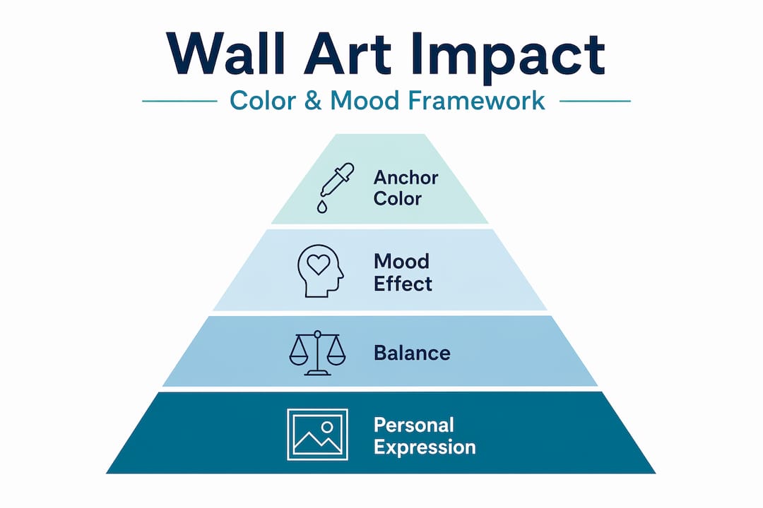
Key Takeaways
| Point | Details |
|---|---|
| Wall art creates focal points | A well-sized piece anchors a room and gives the eye a clear starting point. |
| Color palette sets the mood | Matching artwork colors to room function creates emotional balance without visual chaos. |
| Texture adds depth | Sculptural and material-rich art changes how light moves through a space. |
| Placement determines impact | Correct sizing, height, and lighting separate curated rooms from flat ones. |
| Art expresses personal identity | Thoughtfully chosen pieces turn a house into a home with a distinct story. |
The role of wall art in interiors as a focal point
Every well-designed room has a visual hierarchy. Your eye enters, lands somewhere specific, and then moves through the space in a logical sequence. Wall art is one of the most reliable tools for establishing that entry point.
A focal point does three things: it creates interest, provides balance, and guides movement through the room. Without one, spaces feel directionless. Proper placement and size determine whether a room feels curated or visually flat. That is a design principle that holds across every style from minimalist to maximalist.
The most common mistake is choosing art that is too small. Artwork too small loses its intended impact and makes the room feel uncertain and unbalanced. As a general rule, a piece hung above a sofa should span roughly two-thirds of the sofa’s width, and the center of the artwork should sit at approximately 57 to 60 inches from the floor. That eye-level placement feels natural to the human gaze and keeps the room from looking like a waiting room.
Here is what to get right when positioning wall art as a focal point:
- Scale first. Choose a piece that commands the wall without crowding adjacent furniture.
- Create breathing room. Leave 6 to 8 inches between the bottom of the artwork and the top of any furniture beneath it.
- Consider sight lines. Position the focal piece where it is visible from the room’s main entry point.
- Frame thoughtfully. A strong frame adds visual weight and helps smaller pieces hold their presence.
- Let supporting pieces step back. Not every wall needs a statement. One dominant focal piece works better than three competing ones.
Lighting is the tool that most people forget entirely. Track lighting and picture lights bring out details and significantly improve visual impact. Lighting is the most underutilized enhancer for art focal points because it uses contrast to intensify a piece’s dominance in the room. A well-lit canvas looks twice as intentional as the same piece in flat overhead light.
Pro Tip: Give bold pieces genuine breathing room on the wall. Surrounding a statement artwork with too many smaller pieces dilutes its power. Let it lead.
How art color palettes influence room mood
Color is where wall art becomes genuinely psychological. The psychology of color in wall art shows that matching your artwork’s palette to your room’s function creates balanced, intentional atmospheres rather than accidental ones.
A useful framework is the rule of three colors within a single artwork: one anchor color (dominant), one supporting neutral, and one small accent. This keeps the piece visually coherent and makes it easier to coordinate with existing room colors without forcing an exact match.
| Room type | Recommended palette | Effect |
|---|---|---|
| Bedroom | Soft blues, muted greens, warm neutrals | Calming and restorative |
| Living room | Warm terracottas, earthy tones, muted gold | Welcoming and social |
| Home office | Cool grays, deep navy, sage green | Focused and grounded |
| Dining area | Rich burgundy, warm amber, cream | Convivial and appetite-friendly |
Matching art palette to room purpose reduces visual noise and supports the emotional effect you want each space to produce. A bedroom with vibrant, high-contrast artwork may look striking in a photo, but it works against relaxation when you are trying to sleep.
The quality of printing and the type of lighting in a room also affect how colors read. Warm incandescent bulbs shift cool tones toward yellow. Daylight bulbs preserve color accuracy. When possible, view art samples in the actual room lighting before committing.
- Choose art for the mood you want, not to match your sofa exactly.
- Avoid more than three dominant hues across a gallery wall or grouped arrangement.
- Use color to create contrast with the wall itself for maximum visual impact.
Pro Tip: If you struggle with color coordination, start by pulling one accent color from your existing rug or cushions and build your art search around artwork that features that same hue as a supporting tone.
For deeper guidance on coordinating room color schemes, there are practical frameworks worth exploring before you shop.
Texture and depth through wall art
Texture is a design tool that works on a mostly subconscious level. Walk into a room where the walls hold a woven fiber piece, a metal relief sculpture, or a carved wood panel alongside a smooth canvas, and the space feels physically richer. You may not immediately know why.
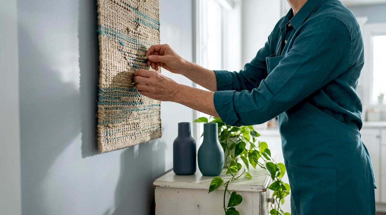
Textured wall art creates light and shadow layers that change the feel of a room depending on the time of day and the angle of light. A smooth, flat room with only painted surfaces absorbs and reflects light uniformly, which reads as cold or sparse. Textured art breaks that uniformity in a way that no paint color can replicate.
This matters especially in rooms with strong architectural elements like exposed concrete, glass, or sharp-edged furniture. Textured art softens those hard lines without requiring structural changes. A metal wall sculpture above a concrete-finish console does something architecturally interesting while remaining entirely practical.
The key to using texture well is balance, not literal matching. Your home’s textural layers should feel cohesive without being repetitive. If your sofa is in a nubby boucle, a smooth resin relief panel on the wall creates contrast. If your floors are polished hardwood, a woven fiber piece introduces warmth.
Pro Tip: When selecting textured art for a room with mixed materials, choose one dominant texture in the art that echoes a secondary texture in the room. This creates connection without imitation.
Practical steps for selecting and placing wall art
Reading your room before you shop is the step most people skip. Walk into your space and identify the natural focal wall. It is usually the first wall you see when entering or the largest uninterrupted surface. That is where your statement piece belongs.
From there, building a cohesive collection of wall art follows a clear sequence:
- Identify your focal wall and choose one statement piece scaled to command it. This is not a filler piece. It should be the artwork you love most.
- Select supporting pieces for secondary walls. These should complement, not compete. Smaller scale, softer palette, or similar framing style keeps them in their supporting role.
- Plan gallery walls by hierarchy. Start with the largest or central work and arrange supporting pieces outward. This prevents competing focal points from creating visual noise.
- Frame consistently. A mix of frame styles can work beautifully, but one consistent element, whether material, color, or finish, ties a gallery wall together.
- Add lighting before finalizing placement. Install a picture light or direct a track light toward the focal piece, then adjust position if needed. Lighting changes everything.
- Check materials and coatings. Some water-based art coatings emit VOCs that persist 60 or more days even when labeled low-VOC. In bedrooms especially, look for pieces with third-party air quality certifications or allow new art to off-gas in a ventilated space before permanent hanging.
- Maintain regularly. Dust canvas prints with a soft dry cloth. Protect works from direct sunlight to prevent fading. Recheck hanging hardware every six months for stability.
Pro Tip: Edit gallery walls by hierarchy, not symmetry. Perfectly symmetrical arrangements often feel rigid. Let the largest piece lead, and build outward with intentional asymmetry for a more organic, curated result.
For specific guidance on styling your living room around art as a focal anchor, there are detailed room-specific tips available worth bookmarking.
Wall art as personal expression
There is a specific moment when a house stops feeling borrowed and starts feeling like yours. Wall art is often what causes that shift.
The impact of wall decor as personal expression is distinct from its aesthetic function. Art you hang because it resonates, not just because it coordinates, communicates something genuine about who you are to anyone who enters. That is why curating wall art around your story and style matters beyond color theory and sizing rules.
Practical ways to use wall art for personal expression:
- Mix timeless and trend. One gallery-quality print you bought years ago carries more authenticity than a wall full of trend-driven pieces. Balance both.
- Rotate art seasonally. Swapping one or two pieces is one of the lowest-cost ways to refresh a room’s feel without any furniture changes.
- Use art to mark meaning. Travel prints, commissioned portraits, or locally sourced work carry narrative weight that mass-produced decor cannot replicate.
- Experiment confidently. There is no permanent mistake with art. If something does not work in one room, it may belong in another.
The importance of wall art lies not just in what it looks like but in what it says. A thoughtfully chosen collection communicates taste, history, and personality simultaneously.
My take on what most people get wrong
I have seen well-furnished rooms that felt completely unfinished, and I have seen modest rooms that felt genuinely alive. The difference was almost always wall art and whether it had been chosen with intention or added as an afterthought.
The biggest mistake I see repeatedly is treating art as the last step in decorating. People spend months choosing sofas and lighting, then grab whatever fits the budget at the end. That approach produces rooms that feel assembled rather than designed. Art functions as part of a room’s system. Scale, hierarchy, and color should be considered alongside furniture, not after.
I also think people underestimate how much lighting determines whether art actually works. I have watched a mediocre print become genuinely compelling under a well-aimed picture light, and I have seen gallery-quality work disappear under flat overhead bulbs. The investment in proper art lighting is almost always worth it.
My honest advice: buy less, choose better, and size up. Most people err toward small when they should go large. One piece that genuinely moves you will do more for a room than four pieces that are just fine. Art transforms not just the walls but how you feel in the space every single day.
— Enn
Find art that fits your space at Newwayref
If you are ready to move from inspiration to action, Newwayref offers a thoughtfully curated selection of home decor products designed to help you personalize your space with confidence. Whether you are searching for a bold statement piece or building out a coordinated gallery wall, the collections are organized to make selection straightforward.
Quality and design are central to what Newwayref carries, including attention to materials that work well in residential environments. Browse the full home decor collection to find wall art and accessories that match your style, your room’s palette, and your personal story. Free shipping on orders over $50 makes it easy to explore multiple options at once.
FAQ
What is the main role of wall art in interiors?
Wall art serves as a focal point, mood setter, and expression of personal style. It establishes visual hierarchy, directs movement through a room, and gives a space its character.
How large should wall art be above a sofa?
Art above a sofa should span roughly two-thirds of the sofa’s width, with the center of the piece hanging at approximately 57 to 60 inches from the floor for comfortable eye-level viewing.
How does wall art affect the mood of a room?
Color palettes in artwork directly influence how a room feels. Cool, muted tones promote calm in bedrooms, while warm, rich palettes support social energy in living and dining spaces.
Is textured wall art better than flat canvas prints?
Neither is universally better. Textured pieces add depth and interact with light in ways flat prints cannot, making them particularly effective in rooms with hard architectural finishes or minimal decor.
What should I know about VOCs in wall art?
Certain water-based coatings on prints can emit VOCs for 60 or more days after purchase, even when labeled low-VOC. Allow new pieces to air out in a ventilated space, especially before placing them in bedrooms.