

TL;DR:
- Color in interiors actively influences mood, physiology, and emotional flow by supporting specific feelings and behaviors. Properly applying the 60-30-10 rule, testing paints in real lighting, and creating a strategic color sequence across rooms optimize home harmony and psychological well-being. Understanding how light, tone, and room function shape color choices allows homeowners to design environments that genuinely support their daily lives.
Color is doing something to you right now. The role of color in interiors goes far beyond aesthetics. It shifts your heart rate, adjusts your cortisol levels, and changes how you feel in a room before you’ve even registered the walls consciously. Most homeowners treat color as a finishing touch, something to sort out after furniture is chosen. That misses the point entirely. Color is a functional decision. Get it right and your home actively supports how you want to feel every single day.
Table of Contents
- Key takeaways
- The role of color in interiors and mood
- Building a palette: the 60-30-10 rule
- Room-by-room color guidance
- How lighting changes everything
- Color as an architectural strategy
- My take on color and why it matters more than you think
- Transform your space with Newwayref
- FAQ
Key takeaways
| Point | Details |
|---|---|
| Color affects physiology | Warm hues raise energy and heart rate; cool hues lower stress and promote calm. |
| Use the 60-30-10 rule | Distribute color as 60% dominant, 30% secondary, and 10% accent to avoid visual chaos. |
| Match color to room function | Choose colors based on what you need each room to do: rest, focus, socialize, or energize. |
| Test paint in real conditions | Small chips under store lighting mislead; test large samples on actual walls over several days. |
| Treat color as architecture | Plan color sequences across connected rooms to create consistent emotional flow throughout your home. |
The role of color in interiors and mood
Color is not neutral. Warm colors raise physiological arousal, increasing heart rate and stimulating energy, while cool colors do the opposite, slowing your nervous system and encouraging calm. This has been confirmed across decades of research, from Jacobs and Hustmyer’s 1974 studies to recent findings in Frontiers in Psychology. It means your living room wall color is actively influencing how you feel during every conversation, every evening in front of the television, every morning you walk through it.
Cool colors, particularly blues and greens, are among the most studied for their physiological benefits. Blue and green lower stress, reducing cortisol in measurable ways, which is why they appear consistently in spaces designed for rest and recovery. Red, by contrast, can actually increase anxiety in enclosed rooms. Understanding these basic responses helps you stop choosing colors you simply like and start choosing colors that work.
Saturation and brightness add another layer. A bright, highly saturated yellow will stimulate very differently than a muted, toned-down version of the same hue. The intensity of a color shapes its impact as much as the hue itself. Here is a quick breakdown of how color temperature divides in practical terms:
- Warm hues (reds, oranges, yellows, warm neutrals): raise energy, encourage conversation, stimulate appetite
- Cool hues (blues, greens, violets, cool grays): promote calm, support focus, lower perceived temperature in a room
- Neutral hues (whites, beiges, true grays): act as visual rest points, amplify adjacent colors
Pro Tip: If a room serves multiple purposes, cool down the background palette with walls in soft blue or sage and introduce warmth through accent colors in textiles and decor.
Building a palette: the 60-30-10 rule
Most color mistakes in home design come from poor proportion, not poor color choice. HGTV recommends the 60-30-10 rule as a reliable framework: 60% of the room should be one dominant color (usually walls and large furniture), 30% a supporting shade (secondary furniture, rugs, curtains), and 10% an accent color (pillows, art, small accessories). This structure prevents any one color from overwhelming the space while creating enough contrast to feel intentional and designed.
What most guides skip is how tint, tone, and shade modifications transform a single hue’s emotional weight. Tint, tone, and shade changes to a base color shift its mood more dramatically than switching to a completely different hue. Adding white creates a tint that feels airy and soft. Adding black creates a shade that reads as dramatic or grounding. Adding gray creates a tone that feels sophisticated but can turn clinical if overdone. Choosing the right modification is often more important than choosing the right base color.
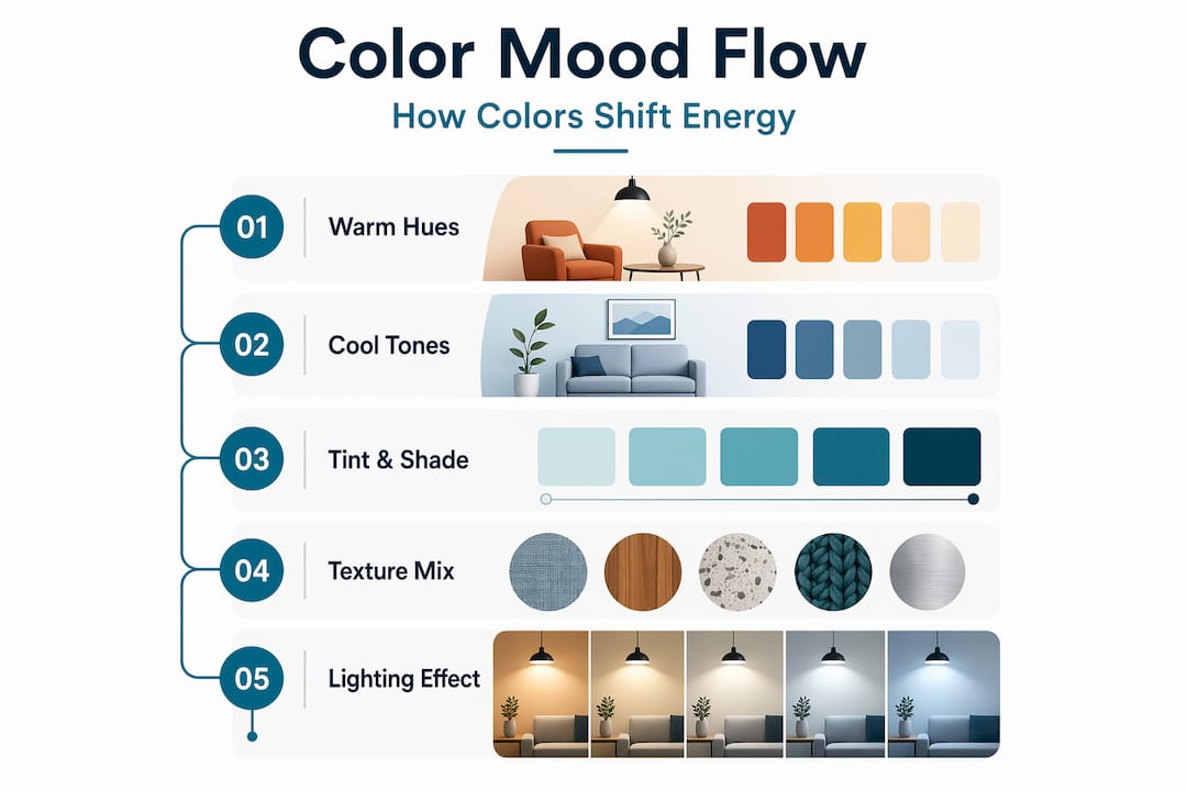
Here is how those modifications compare in real-world use:
| Modification | How it reads in a room | Best use |
|---|---|---|
| Tint (add white) | Light, open, calming | Bedrooms, small spaces |
| Shade (add black) | Bold, dramatic, grounding | Accent walls, dining rooms |
| Tone (add gray) | Sophisticated, subdued | Living rooms, offices |
| Pure hue (no modification) | Intense, stimulating | Accents and small doses only |
A detail that pays off: mixing finishes and textures within the same color family adds depth without adding another color. Matte walls, satin trim, and a velvet sofa in the same warm gray read as a rich, layered palette rather than a flat, single-note scheme.
Pro Tip: Accent pieces work harder than paint when you want to experiment. Swap a throw, a cushion, or a side table before committing to a wall color.
Room-by-room color guidance
Color choices should be linked to room function rather than personal preference alone. A color you love in a restaurant may drain you at home because you are exposed to it for hours every day. The goal is to select colors that support what you actually do in each room.
| Room | Recommended colors | Colors to approach with caution |
|---|---|---|
| Bedroom | Dusty sage, soft blue, warm lavender | Bright red, vivid orange |
| Kitchen | Warm white, soft yellow, light green | Dark gray, cold blue |
| Living room | Warm taupe, soft teal, terracotta | High-saturation primary colors |
| Home office | Muted blue, green-gray, warm white | Red, bright yellow |
| Bathroom | Cool white, pale aqua, soft lavender | Very dark or warm brown |
| Dining room | Deep teal, warm clay, burgundy | Pale, washed-out neutrals |
Bedrooms deserve special attention. Dusty sage lowers cortisol and ranks among the most calming hues for sleep environments. Warm neutral-green combinations outperform both bright greens and stark cool tones in restful spaces. If you are renovating a bedroom for better sleep, sage or muted blue-green is a well-supported starting point.
Home offices benefit from cool, low-saturation tones that support focus without the visual fatigue that comes from overly neutral white walls. Muted blue and green-gray shades hold attention without causing distraction. Dining rooms, on the other hand, benefit from warmer, deeper tones that make food look appealing and conversations feel intimate.
- Kitchens in soft yellow or warm white feel energizing without becoming stressful
- Living rooms in warm taupe or soft teal accommodate both relaxation and socializing
- Bathrooms in pale aqua or cool white signal cleanliness and calm
Pro Tip: Do not paint every room in the same neutral “safe” color to avoid mistakes. Color-matching every room creates monotony, not harmony. Let each room have its own mood.
How lighting changes everything
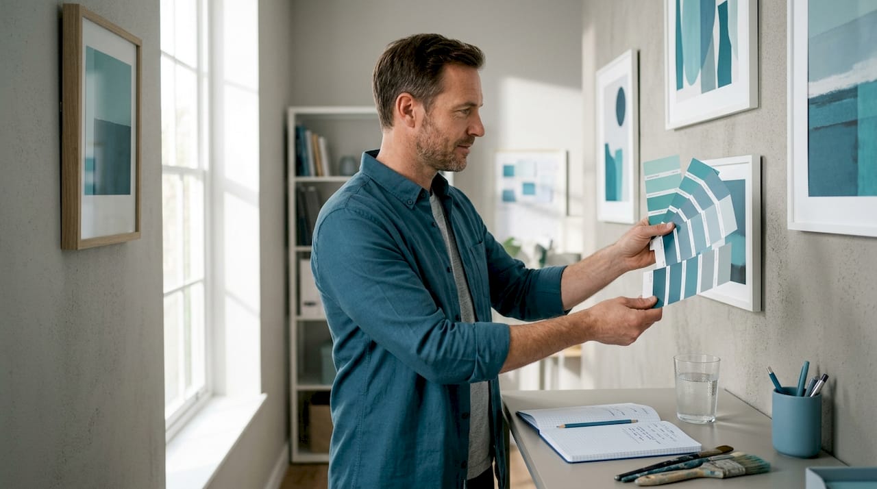
You could choose the perfect paint color and still get it completely wrong because of your lighting. Lighting quality significantly changes how paint colors appear in real rooms. A warm 2700K bulb will make a cool gray wall read as lavender. A cool daylight bulb at 6500K will strip warmth from a creamy white and make it look clinical. The same paint chip will look like two completely different colors depending on the bulb in the room.
Most homeowners test colors with small swatches pinned to the wall under overhead lighting. This approach misses almost everything that matters. Follow this process instead:
- Paint a large section of wall (at least 12 inches by 12 inches) directly on the surface you plan to paint.
- Observe it at different times of day: morning light, afternoon sun, evening with artificial lighting switched on.
- Look at how it reads next to your trim, flooring, and nearby furniture. Adjacent surfaces change color perception significantly.
- Live with the sample for at least two or three days before making a decision.
- Check both the north-facing and south-facing walls if they are in the same room, as each will read differently depending on natural light direction.
Understanding how lighting affects color perception in your specific space is arguably as important as the color choice itself. A good color fails in bad light. Knowing this before you buy a gallon of paint saves time, money, and frustration.
Pro Tip: If you use warm Edison-style bulbs anywhere in a room, test your paint color under those exact bulbs before purchasing. Warm light pulls yellow and orange tones from colors in ways that daylight completely hides.
Color as an architectural strategy
Color should be treated as an architectural decision, not a decorative afterthought. This means thinking about how colors transition from room to room, what emotional sequence your home creates as you move through it, and how that sequence supports your daily rhythm. Walking from an energizing kitchen into a calm bedroom should feel like a gradual, intentional shift, not a visual collision.
Planning that sequence involves a few practical principles:
- Use a consistent undertone across connected spaces. If your kitchen has warm undertones, carry that warmth through the hallway even if the main hue changes.
- Step down saturation as you move toward rest areas. Higher saturation in active spaces, lower saturation in bedrooms and bathrooms.
- Reserve your boldest color for a space that benefits from impact: a dining room, a reading nook, or an entryway that sets the tone for the whole home.
- A tone, saturation, and lighting framework reduces color fatigue far better than chasing trends, because the logic holds up over years, not just seasons.
The fear of “getting color wrong” causes most homeowners to default to the same beige-and-gray combinations that feel safe but ultimately dull. Color confidence comes from understanding the system behind it, not from talent. Once you understand the 60-30-10 structure, the warm-cool spectrum, and the power of tint and tone, you stop guessing and start making deliberate choices your home will reflect for years.
My take on color and why it matters more than you think
I’ve watched homeowners spend months choosing the perfect sofa only to install it in a room where the wall color worked against everything they wanted to feel there. Color is often the last thing people think about and it should be one of the first.
In my experience, the biggest misconception is that you need a trained eye or a designer’s confidence to get color right. You don’t. What you need is a framework and the willingness to test before committing. I’ve seen a single paint change transform a room from something that felt heavy and anxious to something that felt genuinely restful. No new furniture, no renovation. Just the right hue, modified to the right tone, in the right light.
What I keep coming back to is this: color is part of a room’s purpose system. It’s not there to look nice in photos. It’s there to support how you live. When you start treating it that way, decisions get cleaner and results get better.
— Enn
Transform your space with Newwayref
Your color choices set the tone, but the furniture and decor you bring in seal it. At Newwayref, you’ll find a thoughtfully curated selection of modern home furniture and decor designed to complement the color schemes and mood-driven design principles covered in this guide. From accent pieces that nail that 10% color pop to sofas and coffee tables that anchor your dominant palette, everything is selected with your living space in mind.
Whether you’re working with a calming sage bedroom or a warm terracotta living room, Newwayref’s home decor range gives you the pieces to bring your color strategy to life. Free shipping on orders over $50 means you can build out your palette without the added cost. Browse the collection and find what fits your vision today.
FAQ
What is the role of color in interiors?
Color in interiors directly influences mood, energy levels, and physiological states like heart rate and cortisol. It functions as part of a room’s design system, supporting the emotions and behaviors you want to experience in each space.
How does color affect mood in a room?
Warm colors like red and orange raise energy and stimulate conversation, while cool colors like blue and green lower stress and promote calm. The effect depends on hue, saturation, brightness, and how the color is modified with tint, tone, or shade.
What are the best colors for a living room?
Warm taupe, soft teal, and terracotta work well for living rooms because they support both relaxation and socializing. Avoid highly saturated primary colors, which can feel overstimulating over extended time.
What is the 60-30-10 rule in interior design?
The 60-30-10 rule distributes color as 60% dominant (walls and large furniture), 30% secondary (rugs and curtains), and 10% accent (pillows and accessories). It creates balanced, intentional palettes without visual overload.
Why does my paint color look different at home than in the store?
Paint looks different because lighting changes how color reads. Warm bulbs pull yellow and orange tones forward, while cool daylight bulbs strip warmth from colors. Always test a large sample on your actual wall under your home’s lighting before buying.